
Thursday, 20 October, 2011
Our dashboard keeps us focused
We're inching closer to the official release of Skrivr. Apart from all the stuff we're doing with the app itself, we're also prepping behind the scenes.
Our latest addition is the Skrivr dashboard powered by Geckoboard by Paul Joyce. Now, we didn't create our board because we're expecting 100K signups in day one (though it would be nice). We built it so that we can focus on what's important. The way we see it a good dashboard does more than just show you what's going on in your business.
A well executed dashboard evolves the way you think about your business. It helps you focus. It makes you a star at prioritizing.
One can look at reports until the cows come home, but having live up to the minute data makes all the difference. Even for a tiny startup like ours. By seeing the data all day everyday we give it context in a split second simply by going about our everyday business. Day of the week, time of day, world events, local events, they all play a part in understanding a live dashboard in ways that reports can never do.
How to build a brilliant dashboard
To build the best possible dashboard start by figuring out what needs to be on the board. Need being the operative board.
Dashboards can look like the cockpit of a 747 or be super minimalist. It is quite a business specific thing, with on thing in common. Everything on the board should either directly contribute to building a better product (if no-one uses a particular theme it could mean there's a bug in it or that it's too ugly), or make more money (account activation is slow).
We also have some space for the latest tweets to mention @skrivr. It's good to see what's being said especially in the context of what else is on the board.
Next consider where on the board the data goes. Top right for key info? Across the bottom if the dashboard sits high up on a wall? Think it through and try different options.
And spend a good amount of time on the appearance of your data. Having 20 support requests waiting doesn't sound like much. A big pulsating, growing red dot with the number 20 next to it makes it more urgent.
We also believe in spelling stuff out; less thinking more understanding. That's why we're not big fans of dials. Dials need to be read, numbers can be understood. Big difference.
Good luck, let us know how you get on.
What we used
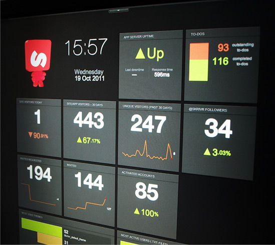
We signed up with Geckoboard by Paul Joyce. They have several nice pre-made widgets that are useful to us including Google Analytics, Basecamp, MailChimp, Twitter and Pingdom.
We also needed information and stats from our own servers, like "Activated accounts", "Most used theme" and user activity. To get those we created our own micro-API that spits out the data in a JSON format so that Geckobard could talk to it and display it in our custom widgets. (We are planning further API development but that's further down the road ...)
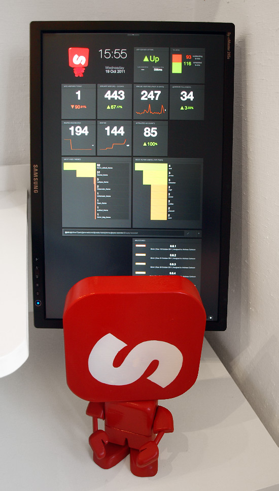
For the screen we borrowed a Samsung SyncMaster 245B TFT from a friend (we wanted to make sure the dashboard really would worked for us before spending money on it). The SyncMaster screen rotates and we flipped it vertically to see as much of the dashboard as possible. We plugged it in to the office G5 Mac and set screen rotation to 90 degrees in the OSX Display System preferences.
And that's the basic Skrivr dashboard set up!
Want to affect our dashboard? Signup to try Skrivr. Once that number starts pulsating the invites are going out!
[Update] After an hour of this post going into Y Combinator's HackerNews the re-tweets started coming and traffic numbers went straight up. Thanks to us seeing the numbers in real-time we could quickly update our blog's sidebar and put in a more prominent beta sign-up button. Once again the dashboard proved itself very useful!
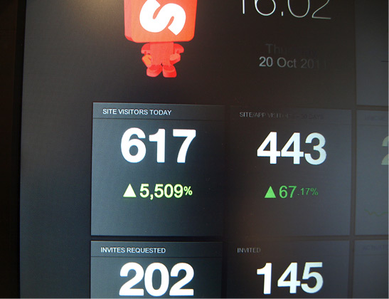 The visitor count went from 1 up to more than 600 (+5500%) after the post was published.